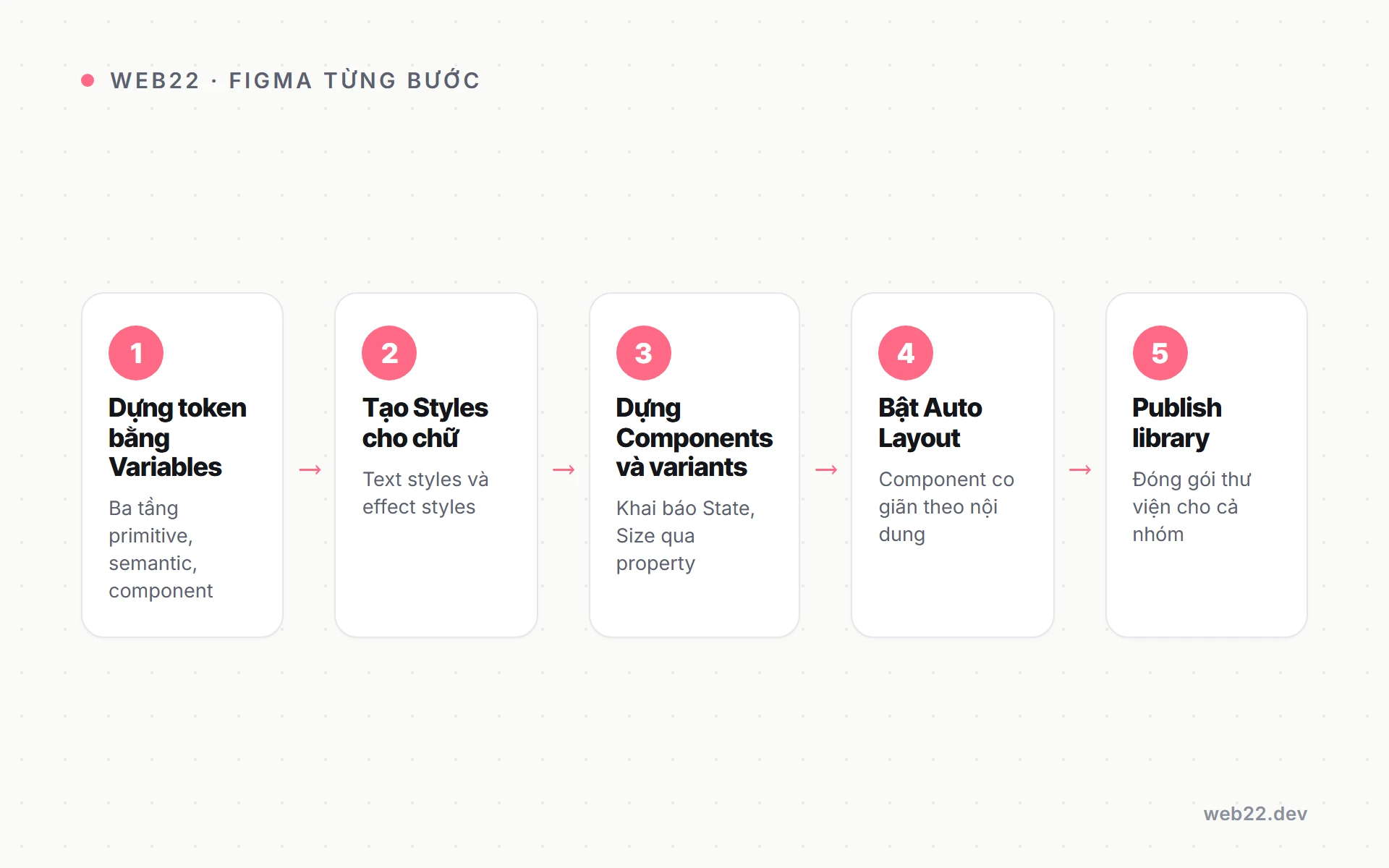

Figma là tool de facto cho design system năm 2026 — 80% DS công khai (Shopify Polaris, Atlassian, GitHub Primer) maintain Figma library cùng với code. Bài này hướng dẫn quy trình 6 step build DS trong Figma cho team mid: setup file structure tách Foundation/Component/Pattern, sync token DTCG qua Tokens Studio, build component với variant + props, publish library cho consumer file, handoff Dev Mode cho frontend dev, kèm 5 lỗi phổ biến và cách fix.
Vì sao Figma là default tool cho design system 2026
Figma có 5 đặc điểm phù hợp với design system: collaboration realtime (designer + dev review chung), component variant + props giống React, version history + branching kiểu Git, Dev Mode (2023) auto-gen CSS, Code Connect (2024) map design ↔ code 1-1.
Sketch và Adobe XD yếu hơn rõ rệt về collaboration và sync code. Penpot open-source là alternative free nhưng plugin hệ sinh thái nhỏ hơn 20 lần so với Figma.
So sánh 3 tool design system năm 2026
Bảng so sánh dưới dựa trên audit Web22 với 8 dự án DS production từ 2024. Figma dominant rõ ràng — chỉ team legacy đầu tư Sketch sâu mới giữ Sketch.
| Feature | Figma | Sketch | Adobe XD |
|---|---|---|---|
| Collaboration realtime | 5/5 | 2/5 (qua Cloud) | 3/5 |
| Component variant + props | 5/5 | 3/5 | 3/5 |
| Dev Mode CSS auto-gen | 5/5 | 2/5 (Inspector) | 3/5 |
| Code Connect (DS sync) | 5/5 | 2/5 (plugin) | 1/5 (limited) |
| Plugin hệ sinh thái | 10.000+ | 500+ | ~100 |
| Recommend cho DS 2026 | Default | Legacy team | Skip |
Cost Figma cho DS team mid
Figma Organization plan 12-15 USD/editor/tháng — cần thiết để dùng feature shared library cross-file và Code Connect. Free và Professional plan thiếu shared library, không phù hợp DS production.
Team 5 editor (3 designer + 2 dev) cost khoảng 60-75 USD/tháng tương đương 1.500.000đ-1.900.000đ/tháng. Cộng plugin Tokens Studio Pro nếu cần Git sync (9 USD/tháng) — tổng tooling Figma 2.000.000đ/tháng cho DS team mid.
Step 1 — Setup file structure tách 4 file workspace
DS file Figma cần structure rõ — tách Foundation, Component, Pattern, Documentation thành 4 file riêng. Monolithic 1 file = chaos sau 50+ component, search chậm, permission control khó.
4 file chính trong workspace Figma DS
Mỗi file có phạm vi riêng và editor permission khác nhau. Junior designer chỉ được edit Components, không touch Foundation để tránh đổi token gây cascade impact toàn site.
- DS Foundation: chứa token color, typography, spacing, radius, shadow — nguồn truth cho mọi style. Chỉ DS lead edit.
- DS Components: Button, Input, Card, Modal — 1 component 1 frame với mọi variant. Senior + DS team edit.
- DS Patterns: Form layout, Empty state, Error state, Onboarding flow — pattern ghép component thành flow.
- DS Documentation: usage guideline, do/don’t, accessibility note, code snippet — kèm screenshot và link Storybook.
Page structure trong file Components
Mỗi component có 1 page riêng với section cố định: Variants, Props panel, Usage examples, Code Connect link. Naming convention [CategoryNumber]-[ComponentName] để Figma sidebar sort đúng thứ tự.
- Form: Button, Input, Select, Checkbox, Radio, TextArea, Switch.
- Overlay: Modal, Drawer, Popover, Tooltip, Dropdown.
- Data Display: Card, Badge, Avatar, Tag, Table.
- Navigation: Tabs, Breadcrumb, Pagination, Menu.
- Phản hồi: Toast, Alert, Spinner, Skeleton, Progress.
Step 2 — Token foundation format DTCG
Token là lớp foundation thấp nhất — color, typography, spacing, radius, shadow. Format DTCG (Design Token Community Group) chuẩn JSON, sync sang code qua Style Dictionary tool.
Setup token mất 1-2 tuần cho 200-500 token.
5 nhóm token + naming convention chuẩn
Naming token theo pattern category.subcategory.variant giúp grep và refactor dễ. Đặt tên semantic (color.primary.500) thay vì literal (color.blue.500) cho phép rebrand mà không phải đổi reference khắp codebase.
- Color:
color.primary.500,color.semantic.error,color.neutral.gray.100— tier 100-900 cho mỗi hue. - Typography:
font.size.body.md,font.weight.bold,font.family.sans,font.lineheight.tight. - Spacing:
space.xs(4px),space.sm(8px),space.md(16px),space.lg(24px) — dựa scale 4px/8px. - Radius:
radius.sm(4px),radius.md(8px),radius.lg(16px),radius.full(9999px). - Shadow:
shadow.sm(subtle),shadow.md(card),shadow.lg(modal).
Plugin Tokens Studio for Figma — workflow sync Git
Tokens Studio for Figma là plugin phổ biến nhất (50.000+ install) cho DTCG sync. Define token trong plugin UI, export ra DTCG-format JSON, push lên Git repo cho dev consume.
# Step 1: Install plugin Tokens Studio for Figma trong Community
# Step 2: Define tokens trong plugin UI panel
# Step 3: Export → DTCG-format JSON
{
"color": {
"primary": {
"500": { "$value": "#2563eb", "$type": "color" },
"600": { "$value": "#1d4ed8", "$type": "color" }
},
"neutral": {
"100": { "$value": "#f5f5f5", "$type": "color" }
}
},
"space": {
"sm": { "$value": "8px", "$type": "dimension" },
"md": { "$value": "16px", "$type": "dimension" }
}
}
# Step 4: Push lên Git repo (GitHub/GitLab) via plugin
# Style Dictionary CLI transform JSON → CSS variables, SCSS, JS const
npx style-dictionary build
# Output:
# - dist/css/variables.css (--color-primary-500: #2563eb;)
# - dist/scss/_variables.scss
# - dist/js/tokens.js (export const colorPrimary500 = '#2563eb';)
Audit token định kỳ tránh chaos sau 6 tháng
Token grow tự nhiên theo thời gian — designer add color cho chiến dịch mới, dev add spacing edge case. Sau 6 tháng không audit có thể 1.500 token, 40% không dùng.
Setup audit weekly: script grep usage token trong codebase, list token zero usage. DS team review, deprecate token unused sau 2 sprint cảnh báo.
Audit này tốn 1-2 giờ/tuần nhưng tránh chaos lớn về sau.
Step 3 — Build component với variant + props
Figma 2023+ support Component Properties giống React props — define variant (primary/secondary), boolean (disabled/loading), text override, instance swap. Build component 1 lần, designer dùng instance với props khác nhau.
Button component example 4 variant × 3 size × state
Button là component complex nhất trong DS vì có nhiều axis variant. Setup đúng từ đầu tiết kiệm 10-20 giờ rework sau khi designer thêm variant ngoài kế hoạch.
- Tạo Master Component Button base với layout auto.
- Add Component Property
variant: primary, secondary, ghost, danger. - Add Component Property
size: sm (32px), md (40px), lg (48px). - Add boolean
disabled,loadingđể toggle state. - Add instance swap
icon-leftđể designer chèn icon từ icon library. - Add text property
labelcho designer override text trong instance.
Total variant matrix tự generate
Total combination: 4 variant × 3 size × 2 disabled × 2 loading = 48 variant. Không cần build từng cái — chỉ cần tạo axis property và Figma tự gen variant matrix.
Designer drag instance Button vào canvas, Properties panel switch variant/size không cần biết Figma component internals. Workflow này giảm thời gian designer so với duplicate component thủ công.
Step 4 — Publish library cho consumer file consume
Publish DS Foundation và DS Components thành shared library để consumer file (file product team, file marketing) import component không cần copy. Update library 1 lần, mọi consumer file thấy update notification.
Workflow publish library 5 step
Publish library cần Figma Organization plan trở lên. Workflow chuẩn để tránh accidentally publish breaking change ra production.
- Trong DS file, mở Assets panel → Publish Library button.
- Figma list changes (added, modified, removed components) — review trước khi confirm.
- Add changelog note: vd “v1.2.0 — add Toast component, fix Button hover state”.
- Click Publish — consumer file nhận notification trong 5-30 giây.
- Consumer file owner accept/reject update — control granular từng component.
Permission control cho consumer file
DS team setup permission để chỉ DS lead có quyền publish. Designer khác có view access vào DS file để xem reference, không có edit access.
- DS Lead: edit + publish quyền đầy đủ cho mọi file DS.
- DS Designer: edit Components file, không edit Foundation, không publish trực tiếp.
- Consumer Designer: view DS file, edit file product riêng — import component từ DS library.
- Dev: view-only access DS file qua Dev Mode để inspect spec.
Step 5 — Dev Mode handoff cho frontend dev
Dev Mode (Figma 2023) là workspace tách biệt với edit mode, designed cho dev inspect spec và copy CSS/code. Dev Mode tách bạch với edit mode giảm risk dev accidentally sửa design.
Tính năng chính của Dev Mode
Dev Mode bundle 4 feature thiết yếu cho handoff. Mỗi feature giảm 5-15 phút mỗi component dev implement so với handoff truyền thống.
- CSS auto-gen: click component, Dev Mode show CSS chính xác (color, padding, font, shadow) — copy paste vào code.
- Spec measurements: hover element thấy distance tới element khác — không cần đo bằng plugin extra.
- Asset export: SVG, PNG, WebP export 1 click với naming convention.
- Code Connect integration: nếu setup Code Connect, Dev Mode show React component code snippet thay vì CSS raw.
Code Connect map Figma ↔ React
Code Connect (Figma 2024) cho dev xem code snippet React thực tế trong Dev Mode. Designer change variant trong Figma → dev thấy <Button variant="primary" /> chính xác để paste vào code.
// src/components/Button/Button.tsx
import { figma } from '@figma/code-connect';
import Button from './Button';
figma.connect(Button, '<FIGMA_BUTTON_NODE_URL>', {
props: {
variant: figma.enum('variant', {
primary: 'primary',
secondary: 'secondary',
ghost: 'ghost',
danger: 'danger',
}),
size: figma.enum('size', {
sm: 'sm',
md: 'md',
lg: 'lg',
}),
disabled: figma.boolean('disabled'),
children: figma.string('label'),
},
example: ({ variant, size, disabled, children }) => (
<Button variant={variant} size={size} disabled={disabled}>
{children}
</Button>
),
});
// Run: figma connect publish
// Sau publish, dev xem Dev Mode thấy code snippet
// tương ứng với variant Figma đang chọn
Step 6 — Documentation và đào tạo cho consumer team
Build DS xong nhưng không document và không đào tạo thì adoption rate sẽ dưới 30%. Documentation cần ở 2 nơi: Figma DS Documentation file (cho designer) + Storybook docs site (cho dev).
Documentation pattern cho mỗi component
Mỗi component cần 6 section docs để consumer hiểu cách dùng đúng. Skip section nào sẽ dẫn tới misuse trong 2-3 sprint đầu sau go-live.
- Mục đích: “Trigger action như submit form, navigate page, open modal” — 1 câu rõ ràng.
- When to use: “Primary action 1 trang. Multiple action: 1 primary + n secondary”.
- When NOT to use: “Navigation đơn thuần — dùng Link component thay”.
- Variants: table mô tả từng variant + use case cụ thể.
- Accessibility: keyboard navigation, screen reader, contrast ratio >4.5:1.
- Code example: snippet copy-paste cho dev với props phổ biến.
Đào tạo session cho team consumer
Đào tạo session 1-2 giờ live demo cho team consumer adopt DS. Tổ chức 2 batch riêng: 1 cho designer, 1 cho dev — focus content khác nhau.
Designer batch: cách import component từ DS library, dùng variant, override property, override style trong instance. Dev batch: cách install npm package, import component, xem Dev Mode, dùng Code Connect snippet trong workflow daily.
Adoption KPI sau 90 ngày go-live
Sau 90 ngày go-live, KPI adoption phải đạt: 60% component import từ DS library (script grep audit), 80% designer dùng instance từ Figma library (không detach), 0 incident drift visual cross-page production.
KPI dưới target = audit lý do: docs khó tìm, component thiếu prop, đào tạo chưa kỹ. Fix root cause trong 30 ngày tiếp, không ép adoption bằng mệnh lệnh top-down.
Materials trainings cần chuẩn bị trước session
Material đào tạo cần chuẩn bị 1-2 tuần trước session. Thiếu material thì session thành lý thuyết, consumer không thực hành được.
- Slide deck 15-20 trang: overview DS, demo 5 component phổ biến, link nhanh tới Storybook và Figma library.
- Cheat sheet 1 trang PDF: 10 component most-used với props chính, code snippet copy-paste sẵn.
- Sandbox project: repo template với DS đã setup, consumer clone về để hands-on trong session.
- Video recording session: upload Notion hoặc Loom cho team không tham gia live xem lại sau.
Phản hồi loop sau đào tạo 2 tuần
Sau đào tạo 2 tuần, mở survey ngắn 5 câu hỏi: consumer đã import component nào, gặp friction gì, miss feature gì. Phản hồi này feed vào roadmap DS quarter tiếp.
Setup channel Slack #design-system-help cho async support — consumer hỏi bất cứ lúc nào, DS team trả lời trong dưới 4 giờ trong giờ làm việc. Detail governance + SLA xem duy trì design system.
5 lỗi phổ biến khi build DS Figma và cách fix
Web22 audit 12 dự án DS Figma từ 2023-2025, 5 lỗi dưới đây xuất hiện ở 8/12 dự án. Setup process từ đầu để tránh — cost rework sau 6 tháng cao gấp 5-10 lần.
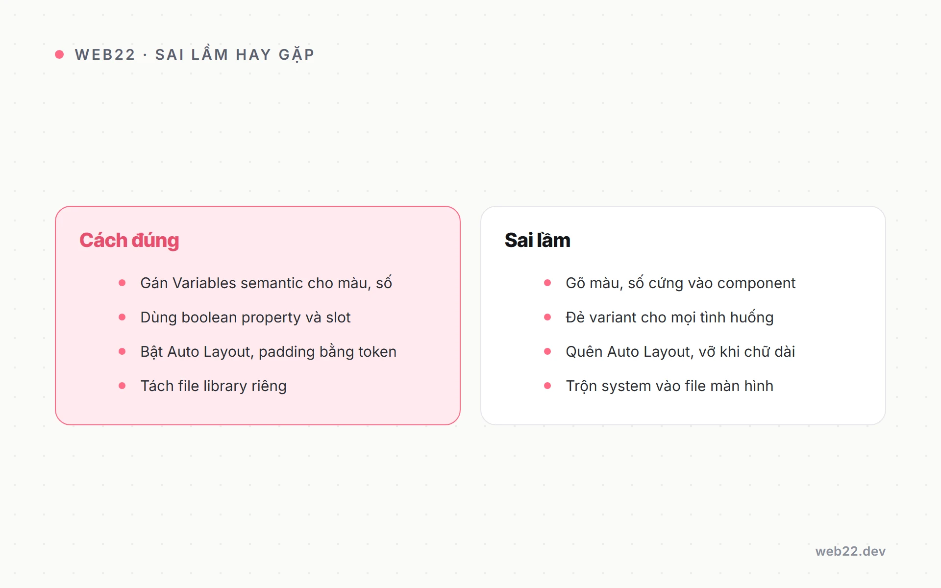
- Token chaos không có structure: 1.000 token random naming, không có hierarchy. Giải pháp: enforce naming convention từ đầu, audit weekly, deprecate token unused.
- Component drift Figma vs code: designer update Figma, dev không update code (hoặc ngược lại). Giải pháp: Code Connect + RFC process cho mọi change.
- Variant explosion: 200+ variant cho 1 Button → file Figma slow load 30-60 giây. Giải pháp: dùng Component Properties (boolean, instance swap) thay vì duplicate variant.
- Designer ignore DS: vẽ free-form không dùng component. Giải pháp: designer đào tạo + KPI usage rate + governance review hàng tháng.
- Dev không adopt DS: code bypass DS, build component riêng. Giải pháp: enforce ESLint rule no-custom-button, code review reject PR không dùng DS.
Setup CI guard chống regression sau go-live
Sau go-live, setup CI guard tự động chống regression. Mỗi PR vào DS repo phải pass 3 check trước khi merge — bảo vệ consumer apps không bị break đột ngột.
- Lint token unused: custom ESLint rule scan codebase, fail nếu PR thêm token mới mà không có usage example trong Storybook.
- Visual regression Chromatic: ảnh chụp mỗi story, fail nếu pixel diff trên 0.1% — reviewer accept hoặc reject change.
- A11y check axe-core: mỗi component story chạy axe-core, fail nếu violation contrast hoặc keyboard nav.
3 check này setup 1-2 ngày dev DS, save 20-40 giờ debugging mỗi quý cho consumer team. ROI rõ ràng cho team trên 5 dev contribute DS.
Câu hỏi thường gặp
Figma DS file nên 1 file hay nhiều file?
Nhiều file: Foundation (token), Components, Patterns, Documentation. Lý do: file lớn 500+ components slow load và navigate khó.
Tách 4 file giúp permission control tốt — junior chỉ edit Components, không touch Foundation.
Cross-file dependency hoạt động qua Shared Library — Foundation publish token, Components consume token đó. Setup này chuẩn cho team 5+ designer.
Bao lâu build được MVP DS với 12-15 component?
6-10 tuần với team 1 designer + 1 dev full-time. Giai đoạn 1 token + foundation 2-3 tuần.
Giai đoạn 2 component MVP 4-6 tuần. Giai đoạn 3 Storybook + Code Connect 1-2 tuần.
Tiến độ kéo dài 12-16 tuần nếu team part-time hoặc thiếu input brand chuẩn (phải làm song song brand audit). Chi tiết ROI và budget xem đầu tư design system.
Tokens Studio plugin free vs Pro?
Free đủ cho 90% use case — define token, export JSON manual, import code. Pro 9 USD/tháng thêm: Git sync auto qua GitHub/GitLab, multi-theme switching, advanced reference.
Team 5-10 người: free đủ. Team trên 20 người: Pro ROI cao qua Git sync — tự động commit token thay đổi từ Figma vào repo, dev không cần manual update.
Code Connect có cần Figma Enterprise plan không?
Cần Figma Organization (45 USD/editor/tháng) hoặc Enterprise plan. Free và Professional plan không có Code Connect feature.
Cost Organization đáng cho team trên 5 designer + dev cần sync chặt. Team nhỏ hơn có thể dùng Dev Mode CSS auto-gen làm thay thế — chậm hơn nhưng đủ workflow.
Có thể skip Code Connect và chỉ dùng Dev Mode không?
Có nhưng dev workflow chậm hơn. Dev Mode show CSS raw (color: #2563eb; padding: 16px) thay vì component code (Button variant=”primary”).
Dev phải mental-map từ CSS sang React component thủ công, dễ sai variant name. Code Connect bridge gap này, ROI cao cho team trên 5 dev frontend.
Chi tiết về stack code-side xem component library là gì.
Cần build design system Figma + token + component MVP turnkey trong 4-8 tuần, tham khảo Báo giá thiết kế giao diện website tại Web22 — phạm vi rõ ràng từ audit, build, publish, đào tạo, hand-off Dev Mode cho dev team.