KIếN THứC WEBSITE › UI/UX DESIGN

Bottom sheet mobile: 3 biến thể (modal/persistent/draggable), snap point, accessibility

Bottom sheet mobile: 3 biến thể (modal/persistent/draggable), snap point, accessibility

Bottom sheet là pattern surface trượt từ đáy màn hình lên, chứa action hoặc content liên quan đến screen hiện tại. Bài này giải thích 3 biến thể (modal/persistent/draggable), snap point logic với spring physics, accessibility focus trap + ARIA, implementation Vaul/Radix UI/Headless UI, so sánh với modal trung tâm và drawer, và 6 lỗi UX phổ biến.

Ba biến thể bottom sheet — modal, persistent, draggable

bottom sheet mobile — Ba biến thể bottom sheet — modal, persistent, draggable
Sơ đồ minh hoạ — Ba biến thể bottom sheet — modal, persistent, draggable
Ba biến thể bottom sheet — modal, persistent, draggable
Sơ đồ minh hoạ — Ba biến thể bottom sheet — modal, persistent, draggable

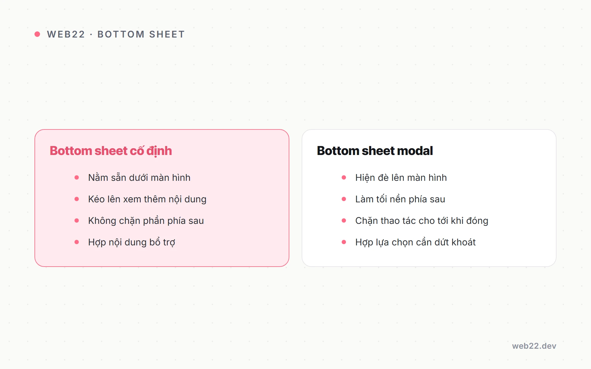
Material Design 3 phân loại bottom sheet thành 3 biến thể dựa trên cách interaction và quan hệ với content phía sau. Mỗi biến thể phù hợp use case khác nhau, không thể thay thế lẫn nhau.

Apple gọi là Sheet (iOS 15+), Material gọi Bottom Sheet.

Modal Bottom Sheet — phổ biến nhất 2026

Modal Bottom Sheet trượt lên với backdrop dim 50-60% opacity bên ngoài, ngăn user tương tác content phía sau. Tap backdrop hoặc swipe-down để dismiss.

Phù hợp action ngắn cần focus user — chọn 1 trong 3-7 lựa chọn (filter, sort, share method), confirm action (xác nhận xoá), input nhanh (chọn date, chọn payment method). Apple HIG cũng khuyên modal sheet thay alert dialog cho mobile.

Persistent Bottom Sheet — coexist với content

Persistent Bottom Sheet không có backdrop dim, coexist với content phía sau. User vẫn scroll được content trên trong khi sheet hiển thị.

Sheet thường ở height nhỏ-trung bình (200-400px), có thể swipe lên mở rộng.

Phù hợp companion content luôn liên quan đến screen chính. Filter sidebar trong shop list (sheet show filter, content show product grid).

Music player mini (sheet show now-playing thumbnail + play/pause). Live tracking (sheet show driver location, content show map).

Draggable Modal Bottom Sheet — snap point peek/half/full

Draggable Modal kết hợp 2 biến thể — có dim backdrop nhưng cho phép drag thay đổi height qua snap point. Snap point chuẩn: peek (200-280px, 25-30% viewport), half (50-60% viewport), full (90-95% viewport, gần như full-screen).

User swipe handle ở top sheet để snap giữa các point. Pattern thấy ở Apple Maps (chi tiết địa điểm), Uber/Grab (chi tiết chuyến), Airbnb (chi tiết listing trong map view).

Cho phép user explore content theo độ depth muốn — peek để có context, full để focus content.

Khi nào chọn biến thể nào

  • Action ngắn (<= 5s): Modal Bottom Sheet. Vd chọn payment method, confirm xoá item.
  • Companion content thường xuyên hiện: Persistent Bottom Sheet. Vd filter trong shop list, mini player.
  • Content explorable nhiều layer: Draggable Modal. Vd chi tiết địa điểm map, listing detail trong feed.

Tránh dùng draggable cho action đơn giản — overkill, gây confusion vì user không biết phải swipe đến full hay tap-and-go ở peek. Match pattern với use case chính của screen.

Snap point logic — physics + UX

Snap point logic — physics + UX

Snap point là vị trí “dừng” cố định mà sheet snap vào khi user thả tay sau drag. Pattern phổ biến nhất 3 snap point (peek/half/full) nhưng có thể 2-5 tuỳ content.

Snap point logic kết hợp physics (velocity của swipe, threshold để snap) và UX (cảm giác tự nhiên không bouncy quá).

Logic snap-to-nearest chuẩn 2026

Nếu velocity swipe > threshold (vd 0.5 px/ms upward), snap đến point cao hơn current. Nếu velocity < threshold, snap đến point gần nhất theo position.

Thuật toán “snap to nearest” này tự nhiên với gesture — user không phải drag đúng đến điểm. Flick nhẹ là đủ trigger snap đến point kế tiếp.

Pattern feels native iOS/Android không phải web junk.

Spring animation transition

Animation transition giữa snap point dùng spring physics, không phải linear hay easing function thông thường. Spring config chuẩn: stiffness 380-400, damping 30-40 (theo Framer Motion default).

Spring tạo cảm giác “tự nhiên” như vật lý thực — sheet chậm dần khi gần snap point, hơi overshoot rồi quay lại stable. Animation duration thực tế 250-450ms tuỳ distance giữa snap point.

Threshold dismiss (snap-to-close)

Nếu user drag sheet xuống quá 30-40% height từ peek, snap về close (dismiss). Nếu drag xuống dưới 30%, snap về peek.

Threshold này tránh accidental dismiss khi user chỉ muốn nudge nhẹ.

Cũng cho phép swipe-down velocity nhanh để dismiss bất kể position — tracking velocity >= 1.0 px/ms downward là intent dismiss rõ. User experienced expect pattern này.

Size snap point chuẩn

  • Peek 180-220px: hợp với content header + 2-3 dòng preview. User scan nhanh, decide có expand không.
  • Half = screen × 0.5: hợp với list 5-7 item visible + sticky CTA. Balance content và backdrop context.
  • Full = screen × 0.9: gần full-screen modal, scroll content khi nhiều. Tránh full 100% — giữ 40-60px ở top để user vẫn thấy backdrop dim, biết sheet là overlay.

Apple Sheet vs Material Bottom Sheet — khác biệt design language

Apple iOS 15 (2021) thêm “Sheet” presentation style với detents (snap point) tương tự Material. Tuy nhiên 2 hệ design có khác biệt visual và behavioral subtle quan trọng khi build cross-platform.

Khác biệt visual

  • Corner radius: Apple Sheet 10pt ở top, Material 28dp rộng hơn nhiều “blob-ier”.
  • Drag handle: Apple visible chỉ khi enable explicit, Material default visible cho Modal Bottom Sheet draggable.
  • Background: Apple dùng .regularMaterial blur (frosted glass effect), Material dùng surface elevation flat.

Khác biệt behavioral

  • Swipe-down dismiss: Apple luôn dismiss kể cả không reach threshold (gesture aggressive hơn), Material chỉ dismiss khi qua threshold 50%.
  • Tap content phía sau: Apple dismiss sheet, Material tap backdrop dismiss nhưng tap content area phía sau (qua hole) không dismiss.
  • Animation: Apple spring nhanh + ít bouncy hơn Material. Material spring chậm hơn với bounce rõ.

Khác biệt content style

Apple Sheet thường có “grabber” thanh ngang nhỏ ở top center (3pt height × 36pt wide). Material Bottom Sheet có “drag handle” 4dp height × 32dp wide cùng vị trí.

Title sheet: Apple đặt center top với close button X bên trái. Material đặt left top với close button bên phải — đảo vị trí close button.

Cross-platform app cần lock 1 style nhất quán.

Chọn style nào cho web cross-platform

Web app cross-platform (cùng codebase serve iOS Safari và Android Chrome) thường chọn 1 style nhất quán thay vì detect platform render khác. Pattern phổ biến: chọn Material 3 style vì doc đầy đủ hơn + Tailwind/shadcn đã có pattern sẵn.

iOS user chấp nhận Material style trên web (khác native app) — không phải dealbreaker. Nếu muốn cross-platform native feel, dùng React Native hoặc Capacitor để render native bottom sheet thay JS.

Implementation với React — Vaul, Radix UI, Headless UI

Implement bottom sheet từ scratch phức tạp vì cần handle: drag gesture (touch + mouse), spring animation, snap point logic, focus trap, escape key, scroll lock body. 2026 có 3 library mature giải quyết.

Vaul — nhẹ nhất, recommended 2026

Vaul (do Emil Kowalski, dev Linear) là library bottom sheet nhẹ nhất 2026. Built trên Radix UI Dialog primitive, expose API simple với snap point declarative.

Bundle size khoảng 5KB gzip. Hỗ trợ iOS keyboard offset, scroll behavior intelligent (drag scroll content khi at full, drag sheet khi at peek).

Recommended cho 90% project React 2026. Docs: vaul.emilkowal.ski.

import { Drawer } from 'vaul';

<Drawer.Root snapPoints={[0.3, 0.6, 0.95]}>
  <Drawer.Trigger>Open</Drawer.Trigger>
  <Drawer.Portal>
    <Drawer.Overlay />
    <Drawer.Content>
      <div className="handle" />
      Content here
    </Drawer.Content>
  </Drawer.Portal>
</Drawer.Root>

Radix UI Dialog primitive

Radix UI Dialog primitive + custom CSS animation cũng được dùng phổ biến. Radix lo phần accessibility (focus trap, ARIA, escape key, scroll lock) ra khỏi box, mình tự thêm drag gesture qua framer-motion hoặc react-spring + spring config.

Phù hợp khi đã dùng Radix cho primitive khác (Tabs, Popover, Menu). Bundle khoảng 12KB gzip cho Dialog + framer-motion drag.

Học curve cao hơn Vaul nhưng flexibility cao hơn.

Headless UI Dialog

Headless UI Dialog (Tailwind Labs) tương tự Radix về philosophy — primitive headless không có style. Phù hợp Tailwind project.

Drag gesture cần thêm thư viện ngoài.

Bundle nhỏ khoảng 8KB Dialog + ngoài. Adoption thấp hơn Radix nhưng tích hợp tốt với Tailwind hệ sinh thái.

Phù hợp project đã commit Headless UI cho component khác.

Custom implementation cần handle 8 điểm

Nếu không dùng library, custom implementation cần handle 8 điểm sau. Skip bất kỳ điểm nào sẽ gây bug nghiêm trọng cho user.

  • Touch event listener: với passive: false để preventDefault scroll khi drag handle.
  • Calculate velocity: = delta y / delta time để snap-to-nearest hoặc dismiss.
  • Spring animation: transform translateY (không top/bottom — better performance).
  • Body scroll lock: khi sheet open (overflow: hidden + position: fixed).
  • Focus trap: Tab key chỉ chạy trong sheet.
  • Escape key dismiss: keyboard user dễ exit.
  • iOS keyboard offset: content shift up khi keyboard hiện.
  • Safe-area-inset-bottom padding: cho iPhone notch.

Anti-pattern implementation

Dùng height animation thay vì transform: translateY — performance kém, jank trên phone yếu. Re-layout liên tục, drop frame.

Không lock body scroll → user scroll page phía sau lẫn lộn với scroll trong sheet. Không có focus trap → keyboard user lạc khỏi sheet.

Không escape key dismiss → keyboard user kẹt. 4 lỗi này phá UX hoàn toàn.

Bottom sheet vs modal trung tâm vs drawer

3 pattern overlay phổ biến trên mobile có overlap use case nhưng không thay thế lẫn nhau. Hiểu khác biệt giúp design đúng pattern, tránh dùng modal trung tâm cho mọi trường hợp (anti-pattern phổ biến nhất).

Modal trung tâm — legacy desktop port

Modal trung tâm (centered modal, alert dialog) là pattern desktop legacy port lên mobile. Box ở giữa screen, dim backdrop, OK/Cancel button bottom.

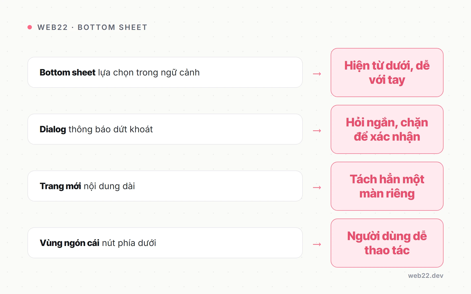
Nhược điểm trên mobile: xa thumb zone (top half khó với), animation từ giữa scale ra cảm giác “popup” không tự nhiên, content giới hạn vì box không scale. Chỉ nên dùng cho alert nguy hiểm cần attention 100% (delete account, payment failed), confirm 2-button đơn giản (Yes/No high stake).

Bottom Sheet — tốt hơn modal cho 80% case

Bottom Sheet tốt hơn modal trung tâm cho 80% use case mobile vì gần thumb zone, swipe gesture tự nhiên dismiss, content scale được (peek/half/full), animation từ dưới lên feel native iOS/Android.

Nên dùng cho pick option (sort, filter, share, payment method), confirm action low-medium stake (đăng ký bản tin email), input nhanh (date picker, time picker), companion info (chi tiết item trong list, tooltip extended).

Drawer / Side Panel — navigation hierarchy

Drawer trượt từ trái/phải, full-height. Phù hợp navigation menu (xem navigation ứng dụng di động) hoặc filter panel với nhiều control.

Khác bottom sheet ở orientation: drawer vertical full-height, sheet horizontal-bottom. Drawer trái/phải truyền cảm giác “hierarchical” (drill into navigation), sheet truyền cảm giác “context-related” (chi tiết liên quan screen hiện tại).

Quy tắc thumb-of-rule chọn pattern

  • Action liên quan trực tiếp screen hiện tại + ngắn: bottom sheet.
  • Navigation đến destination khác hoàn toàn: drawer hoặc full-screen.
  • Alert critical 2-button: modal trung tâm với explicit confirm.
  • Pick option list dài: bottom sheet draggable hoặc full-screen modal.
  • Form dài: full-screen modal hoặc dedicated screen, không nhồi vào sheet.

Accessibility cho bottom sheet

Bottom sheet là interactive overlay phức tạp, accessibility nếu làm sai sẽ block user khuyết tật hoàn toàn. WCAG 2.2 + ARIA Authoring Practices Guide có nhiều yêu cầu.

Reference accessibility thiết kế web cho framework chung.

Focus trap và restoration

  • Focus trap: khi sheet open, Tab key chỉ navigate trong sheet, không escape ra ngoài. Khi close, restore focus về element đã trigger sheet (button “Open”).
  • Library Vaul, Radix UI Dialog handle sẵn. Custom code phải dùng focus-trap-react.
  • ARIA roles: sheet có role="dialog" (modal sheet) hoặc role="region" (persistent sheet). Set aria-labelledby trỏ đến title sheet hoặc aria-label nếu không có title visible. aria-modal="true" cho modal sheet để screen reader biết outside content inert.

Keyboard support và screen reader

  • Keyboard: Escape key dismiss sheet. Tab/Shift+Tab navigate trong sheet.
  • Enter/Space trigger button focused. Arrow keys cho list items nếu có.
  • Test với physical keyboard plugged into phone (USB-C OTG hub).
  • Screen reader: khi sheet open, screen reader (VoiceOver iOS, TalkBack Android) phải announce “Dialog opened, [title]”. Auto khi dùng role="dialog" + aria-modal.
  • Khi close announce “Dialog closed, returned to [previous context]”.

Reduced motion và contrast

  • Reduced motion: user vestibular disorder bị chóng mặt với spring animation. Detect @media (prefers-reduced-motion: reduce) và fallback xuống fade animation 100ms hoặc instant.
  • Vaul có flag shouldScaleBackground respect setting này.
  • Touch + mouse: drag handle phải trigger được cả touch (mobile) và mouse (desktop). User trên touch laptop cũng cần drag được.
  • Dùng pointer event cover cả 2 thay touch event riêng.
  • Color contrast: title sheet >= 5:1 (WCAG 1.4.3 AA), body >= 5:1, drag handle >= 3:1 (visual element không phải text). Test với WebAIM Contrast Checker.

Content design trong bottom sheet — viết gì, layout sao

Content trong bottom sheet thường constrained bởi space (peek 200-280px, half 400-500px). Viết content hiệu quả cần techniques khác paragraph dài blog post — ngắn gọn, action-oriented, không lan man.

Title sheet ngắn 2-5 từ

“Sắp xếp”, “Bộ lọc”, “Chia sẻ”, “Phương thức thanh toán”. Tránh title dài vì wrap 2 dòng tốn không gian.

Title center top hoặc left top tuỳ design language.

Kèm close button X góc kia — Apple style X trái, Material X phải. Lock 1 pattern xuyên app để user quen vị trí.

Action list 3-7 item là content phổ biến nhất

Mỗi item: icon left 24×24 + label 1-2 dòng + chevron right (nếu drill deeper). Item height 56dp (Material standard) — tap area đủ chuẩn touch target.

Spacing 0px giữa item (separator hairline 1px), spacing 8-12dp giữa group. Visual hierarchy clear qua separator + group title (12-14px gray, uppercase optional).

Form trong sheet — 3-5 field max

Form trong sheet hợp với 3-5 field max. Quá nhiều nên dùng full-screen modal hoặc dedicated screen.

Field height 44-48px (xem touch target tối thiểu), font >= 16px tránh iOS auto-zoom.

Submit button sticky bottom của sheet, không phải float trong form scroll. User scroll xem field sau vẫn tap submit được.

CTA button cuối sheet — 1-2 button max

Primary “Xác nhận” / “Lưu” full-width hoặc 60% width. Secondary “Huỷ” 40% width hoặc text link.

Pattern destructive: “Xoá” red color + 1 confirm step bằng dialog confirm khác (tổng 2 tap), không 1-tap delete.

Hierarchy rõ ràng qua spacing + font weight + color. Title bold 16-18px, label semibold 14px, description regular 13-14px gray.

Tham khảo typography scale chuẩn design system.

6 lỗi UX bottom sheet thường gặp

Audit Web22 cho 20+ ứng dụng di động/site khách 2024-2025 với bottom sheet, lỗi sau lặp lại nhiều nhất. Đa số đến từ thiếu test thiết bị thật hoặc copy library mà không hiểu nguyên lý.

  • Lỗi 1 — Sheet height fixed không scroll: sheet content dài hơn snap point, content cuối bị cắt. User không scroll được vì gesture conflict với drag sheet.
  • Sửa: cho phép scroll content khi at full snap point (Vaul handle sẵn). Hoặc giảm content vừa snap point.
  • Lỗi 2 — Tap backdrop không dismiss: user expect tap outside sheet dismiss (convention từ modal). Nếu không, user kẹt phải tìm close button.
  • Sửa: tap backdrop dismiss mặc định, trừ trường hợp specific (form dài user đang nhập, dismiss có thể mất data → confirm trước).
  • Lỗi 3 — Animation lag/jank trên phone yếu: animation duration 800ms với heavy easing → cảm giác chậm. Hoặc animate height thay transform → re-layout liên tục, drop frame.
  • Sửa: animate transform: translateY, duration 250-400ms, will-change: transform để GPU acceleration. Test trên Android mid-range không phải iPhone Pro.
  • Lỗi 4 — Sheet che CTA quan trọng phía sau: persistent sheet ở height half che 50% screen, bao gồm “Xem giỏ hàng” CTA của user. Sửa: persistent sheet chỉ peek 30%, hoặc reposition CTA lên top khi sheet open.
  • Lỗi 5 — Iframe / nested scroll trong sheet: nested scroll (sheet draggable + content scroll trong sheet) có gesture conflict. User drag content thì sheet snap không respond, ngược lại drag sheet thì content scroll lẫn.
  • Sửa: dùng library handle nested scroll (Vaul có “scroll lock when content scrollable”), hoặc tránh nested scroll.
  • Lỗi 6 — Sheet open khi keyboard hiện không offset: user tap field trong sheet, keyboard hiện, che mất field đang focus. Sửa: detect keyboard event (visualViewport API), shift sheet up bằng padding-bottom hoặc transform.
  • Vaul handle sẵn iOS keyboard offset.

Câu hỏi thường gặp

Bottom sheet có replace được modal dialog hoàn toàn không?

Không hoàn toàn. Modal dialog vẫn cần cho 3 case.

Alert critical đòi hỏi attention 100% (delete account, payment failed). Confirmation 2-button cho action high-stake (xoá order, huỷ đăng ký).

Error state thể hiện rõ severity.

Bottom sheet hợp với 80% case khác — pick option, share, filter, sort, info extended. Quy tắc: nếu action có thể undo dễ → sheet, nếu không undo được hoặc impact lớn → modal dialog với explicit confirm.

Web app dùng bottom sheet thay native iOS sheet được không?

Được, library Vaul/Radix simulate gần native. Khác biệt nhỏ: animation iOS Safari có thể không smooth bằng native (do JS animation vs Core Animation), gesture có thể nhẹ delay (do JS event loop).

Cho 95% user không nhận ra khác biệt. Native iOS sheet chỉ available qua React Native hoặc Capacitor wrapper, web app pure không truy cập được.

Production e-commerce VN thường dùng web sheet, conversion không khác biệt significant so native.

Snap point có thể custom theo content height không?

Được nhưng cần handle careful. Vaul cho snap point dạng số (“180px”) hoặc fraction (“0.3”).

Custom height = content actual height giúp sheet không có space trống dưới content (peek = vừa header + 2-3 dòng preview).

Phải đo content height sau render (useEffect, ResizeObserver), update snap point dynamically. Phức tạp hơn fix snap point nhưng UX mượt hơn cho content variable size.

Cân nhắc trade-off complexity.

Bottom sheet trên iPad / tablet hiển thị thế nào?

Material 3 khuyến nghị bottom sheet vẫn ở bottom edge trên tablet portrait, switch sang side sheet (trượt từ phải) trên tablet landscape >= 600dp. Apple iOS có “Form Sheet” presentation cho iPad — sheet ở giữa screen với rounded corner.

Web responsive thường convert: viewport < 768px → bottom sheet, >= 768px → centered modal hoặc side sheet. Vaul có direction prop (“bottom”, “top”, “left”, “right”) để switch dễ.

Có cần handle gesture xung đột giữa scroll content và drag sheet không?

Có, đây là điểm khó nhất implement bottom sheet. Logic chuẩn 3 bước.

Khi sheet at peek/half, mọi drag area trigger sheet snap. Khi sheet at full, drag handle area (top 20-30px) trigger sheet dismiss, drag content area trigger content scroll.

Khi content scroll lên top (scrollTop = 0) và user tiếp tục drag down, switch về sheet drag để dismiss.

Vaul implement logic này tự động qua scrollLock detection. Custom code phải tự handle qua scrollTop check + conditional preventDefault.

Test kỹ trên 3-5 device thật.

Bottom sheet có ảnh hưởng SEO không?

Không trực tiếp vì sheet thường chứa action/UI, không phải content cho indexing. Nhưng nếu sheet contain content cần SEO (vd FAQ, product spec extended), Google bot không trigger sheet để crawl — content invisible cho SEO.

Sửa: render content trong sheet vào DOM khi sheet close (display: none), bot vẫn crawl được. Hoặc dùng dedicated page cho content cần SEO, sheet chỉ chứa UI/action.

Pattern này quan trọng cho e-commerce mobile.

Library nào nhẹ nhất cho bottom sheet React 2026?

Vaul (~5KB gzip) là nhẹ nhất với feature đầy đủ (drag, snap, accessibility, iOS keyboard offset). Headless UI Dialog (~8KB) + custom drag bằng framer-motion (~30KB nếu chưa có) tổng nặng hơn.

Radix UI Dialog (~12KB) + custom drag tương tự.

Nếu app đã dùng framer-motion cho animation khác, bundle thực tế Vaul + framer-motion không tăng đáng kể. Cho project chưa có animation library, Vaul standalone là choice tốt nhất 2026.

Tổng kết và bước tiếp theo

Bottom sheet là pattern overlay native-feel cho mobile 2026, thay phần lớn modal trung tâm cho 80% use case. 3 biến thể (modal/persistent/draggable) cover từ action ngắn đến content explorable.

Vaul library recommended cho React project.

Snap point spring physics + accessibility focus trap + ARIA là 3 trụ cột implementation đúng.

Bài liên quan trong cluster UI/UX mobile:

Web22 build mobile UI với pattern bottom sheet end-to-end cho e-commerce, banking app, social — từ wireframe Figma snap point chuẩn, implement React/Vue với Vaul/Radix, accessibility WCAG 2.2 AA, đến QA gesture trên 5+ thiết bị thật. Tư vấn brand identity + design system trọn gói — kết hợp design + dev mobile UI 4-8 tuần cho app mid-size 15-30 screen.